I’m currently at the AAVSO meeting in Cambridge, MA. I just had one of the most terrifying experience of my public speaking life. I attached my laptop to the overhead projector cable and my CPU DIED. Died died died died died.
I paniced (and hopefully hid it well), rebooted, and my computer decide it was going to do a split screen display with the projector as the primary monitor (EEK), and fixed it, all while going through the “pictures aren’t required” intro part of my talk (EEK EEK). When I opened PowerPoint I totally missed that it opened a recovered file instead of the correct file (ACK!), and half way through my talk I ceased to slides (breath breath breath), so I closed the recovered file, opened the correct file, and made it through, somehow, only going maybe a minute over.
That was by far the worst talk I have given. Ever. Ever. I did better as an 8th grader.
I’m now sitting in the corner of the room, blogging my quickly beating heart out.
Okay. Breath.
I will never again try and give a talk without rebooting my CPU right before hand. I knew better, but it is a new CPU with 4GB of memory, so I thought it would be okay. I was so totally wrong.
Anyway…
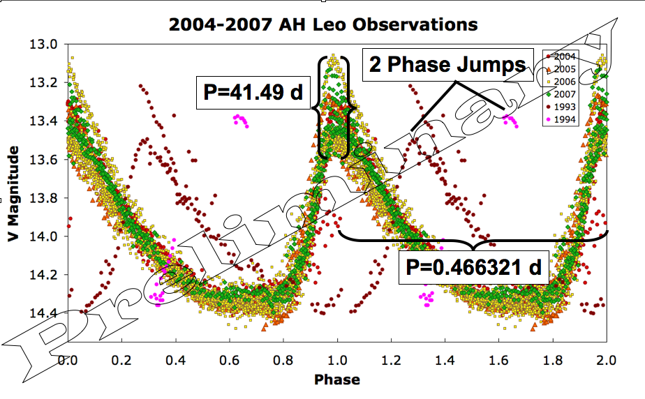
I gave a talk on AH Leo, my favorite pet star. The basic results are summed up in the graph below.
(The really large Preliminary means I still need to finish my error analysis, to make sure I didn’t go to a ludicrous number of decimals anywhere. )
So, what does all this mean. Well, first go read this if you didn’t go read it above.
After that article was written, I requested an observing campaign from the AAVSO and they supplied me with several thousand wonderful data points. Before I could finish the analysis, AH Leo rose for the 2007 observing season, so I got one more season of data before settling down for analysis.
The way the data is analyzed is pretty straight forward. Imagine that you are looking at an EKG of someones heart. It should repeat over and over exactly the same. Now imagine you have a loose wire, and every part of a second, you loose signal. In this case (hopefully) the heart is doing the same thing over and over, but you don’t see the whole shape. To see the entire shape, you can cut up the EKG plot into one heart beat junks, and line up the data. Mathematically, you are taking the (Time of measurements / length of time for heartbeat) = Phase. What we plot is phase versus signal from heart.
For stars, instead of loose wires, our data suffers from daylight, clouds, and moonlight preventing data from being acquired. But, if we observe enough nights, we can get the whole cycle (although stars with ~1 day pulsation periods are really annoying).
To make it easier to see the transition between cycles, it’s customary to take the phase diagram and add 1 to it (or subtract 1), and create side by side, identical phase diagrams on the same plot. That’s what is in the image above.
This particular star has a 0.466321 d period. That I believe within 0.000005 d (I think), but I want to work more on my error analysis so I can put on better error bars.
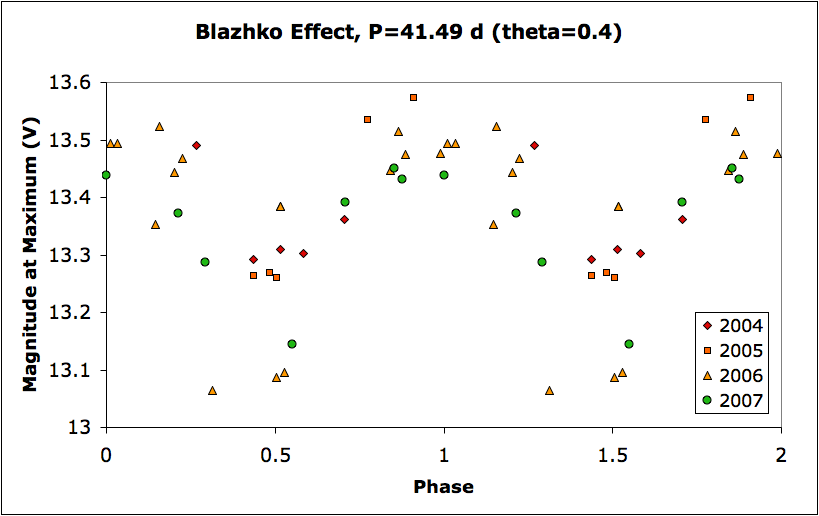
This star (as you read) is weird and its brightness at maximum light varies. Thanks 4 years of hard observing, I think the period to vary is 41.49 d (error may be >0.1 day though, so don’t use this number until I get my error analysis complete and get a paper through peer review. Caveat Caveat) To get this number, I fit each night of data that showed the inflection point at maximum light and made a table of the fit time and brightness for maximum. It’s really ugly:
But, despite the ugliness, it is possible to see the shape of the curve.
It was a long route to get here, and I’m not done yet. But I’m 90% of the way there.
More after dinner…


>More after dinner…
Yea! You guys vanished! Utterly vanished! Everyone!
Now, yes, that has forced me to be a very responsible Astronomical Technologist and stay in the office to scan Dr. Percy’s slides for tomorrow, but still! 🙂
I’m an avid AstronomyCast listener, so I’m sure your presentation went much better than you’ve said.
Good luck with the remainder of your research on AH Leo!
“I will never again try and give a talk without rebooting my CPU right before hand. I knew better, but it is a new CPU with 4GB of memory, so I thought it would be okay. I was so totally wrong.”
“IT IS A NEW CPU….”
new means it will definitely bomb
Really good and really interesting post. I expect (and other readers maybe :)) new useful posts from you!
Good luck and successes in blogging!