
Twitter Bird
Back in October when AAS abstracts were due, I decided to submit something that would force me to think, program, and do something just for fun and not for grants. My original idea was to (utilizing Many Eyes and Processing) do a data visualization of how all the followers of many different astronomy tweeting groups are connected.
Why? Two reasons: I wanted to know how much we are just talking to ourselves (if all of my followers follow Phil Plait, why RT?), and I wanted to know what side interests draw people together (Do people systematically follow all things Moon related?). My goal was to start with a group of selected users – NASA related folks, Zooniverse related folks, and people involved in Astrosphere’s projects (365 Days of Astronomy, Astronomy Cast, etc). I only used people active in twitter (sorry Fraser and your @fcain account, you don’t tweet), and my plan was to download all their basics (when they joined, number of updates, number of followers, etc) and then get the same for all their followers, and then get just the IDs of the followers-followers so I could build a 3d network.
For fun. ‘Cause I can. But curiosity than killed the CPU.
After I sat down, sorted out how to use the twitter API (and how to get authorized to use some of the more interesting functions), after I built in the needed ‘now pause until the beginning of the next hour because you can only make n API calls an hour, where n varies with function.’ After all of this, I set my code running.
And I waited 2 days while it ran.
Then I sat down and asked it look for how often different combinations appear – how often do people follow me and @orbitingfrog or @galaxyzoo and @chrislintott?
And I waited over night and over breakfast (sad hot little laptop) for it to run on the first level of who follows which of my initially selected hubs.
And I then I decided over lunch, for a poster this is enough. This is fun, and I’ll abuse a bigger server later.
So I started visualizing. If you are a data manipulating kind of person and you’ve never played with Many Eyes, go play. It is an awesome site with the ability to map data in lots of different ways. After uploading my data, I asked it to map my data in a way that would show all the connections and map them in a way that the more connections two people have, the closer their circles appear, and the more followers a person had, the larger their circle would be.
And it said please w…a….i….t (please). And I did. And it tried really hard, but produced something that couldn’t be explored on my sad little laptop.
So I did something a bit easier you can interact with here and see below: a map of what fraction of a users followers are shared with 1 or more other hubs. This simple (and no real wait required) visualization shows that all of us have ~20 to ~85% of our followers in common. The below tile plot visualizes the size of each Hubs following via area and relates what percentage of those followers are also connected to other Hubs via the tiles color. Lighter tiles have a higher proportion of their followers linked to non-Hubs, and are thus more often reaching non-astronomy centric audiences. Darker tiles have a higher proportion of their followers also following other astronomy hubs. While this may be seen as “speaking to the choir” it can also be seen as being more effective at pipe lining audiences to other projects (e.g. NASA_Lunar) or as having an audience that results from successful pipe lining from other projects (e.g. moonzoo). NB For this graph, @starstryder & @orbitingfrog were grouped into Astrosphere and Zooniverse respectively based on the recent focus of their online identities. I interpret the overall degree of connection observed as a sign of our RT ability through RT to send people to one another and the connectedness of our community in general. All of the hubs were connected by no more than 1 degree of separation!

Tweep Followers (Area) and Connections (Color)
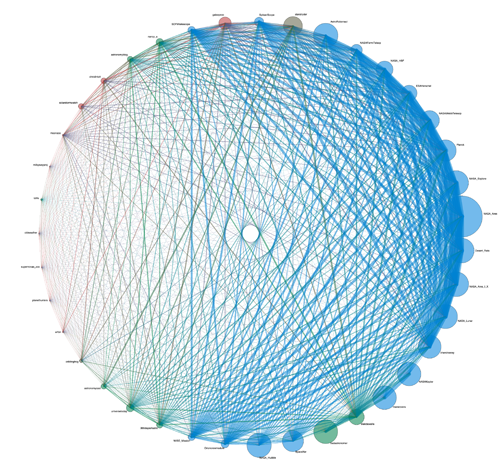
While I was unable to generate the explorable 3-D mapping I desired, I did the best I could by first placing all of us on a circle (figure below) and using size, color, lines to map what I could. This diagram shows the connections between users, where the color of the connections is a blending of the colors of the Hubs (NASA: Blue, Zooniverse: Red, Astrosphere: Green. and people who are both Astrosphere and Zooniverse in Brown). (click to embiggify)
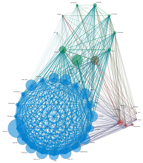
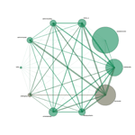
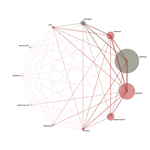
This diagram makes it hard to see exactly how each of the communities are connected to one another. I pulled our Hubs out into the same groups with the same colors, and the thickness of vertices still indicates number of connections and area of the circles indicates number of followers. It can be seen that the NASA tweeters are both very well internally connected and also share more connections in common with other Hubs than the members of the other Hubs share within their own groups’ Hubs. The degree to which programs are con-
nected to NASA is in part due to NASA Hubs simply having more followers and thus a higher opportunity to
share followers. This isn’t the entire answer however, as BadAstronomer is one of the largest Hubs and not as connected (a function of his often skeptism focused tweeting).
For now, I’m going to let you explore these images on your own, checking out who is connected to whom. I’m going to do more work on this, and I’ve set as a goal (that may get destroyed by travel) to work on this a few hours each week, adding more graphs as I go. I’d hoped for today to have a form that allow you to add in your screen name and some meta data, but while traveling my server is resisting code uploads (translation, I changed my password after the last hack, and the password is on my home computer). My next post should be a “Here’s how you can be part of our map.”
Until then, my sad little CPU will be allowed to cool off.




I like the illusion of concentric rings in those graphs, produced by the intersecting lines. Very cool.
Itcould be interesting to see the change over time of this diagram and correlate it with activity. I have the feeling that twitter is one the communication media which shares a lot with fire. Your number of followers seem to blaze, remains high for a while, then died out but the ashes remains.
Super cool! I should follow your example and embark on more hard-but-fun projects that aren’t for any particular (external) reason.
I would be curious what software these diagrams were created in. Very cool!
Hi Gary,
I used the Processing language (see http://processing.org), and tools at Many Eyes.
The study of objects outside our galaxy is a branch of astronomy concerned with the formation and evolution of Galaxies; their morphology and classification; and the examination of active galaxies, and the groups and clusters of galaxies. The latter is important for the understanding of the large-scale structure of the cosmos.-^;:
Our new blog
<http://www.healthmedicinejournal.com